TL;DR: A 2019 county-level analysis found that income, SSI, SNAP, education, commute, and work patterns explained about 70% of U.S. variation in frequent poor mental health days.
Key Findings
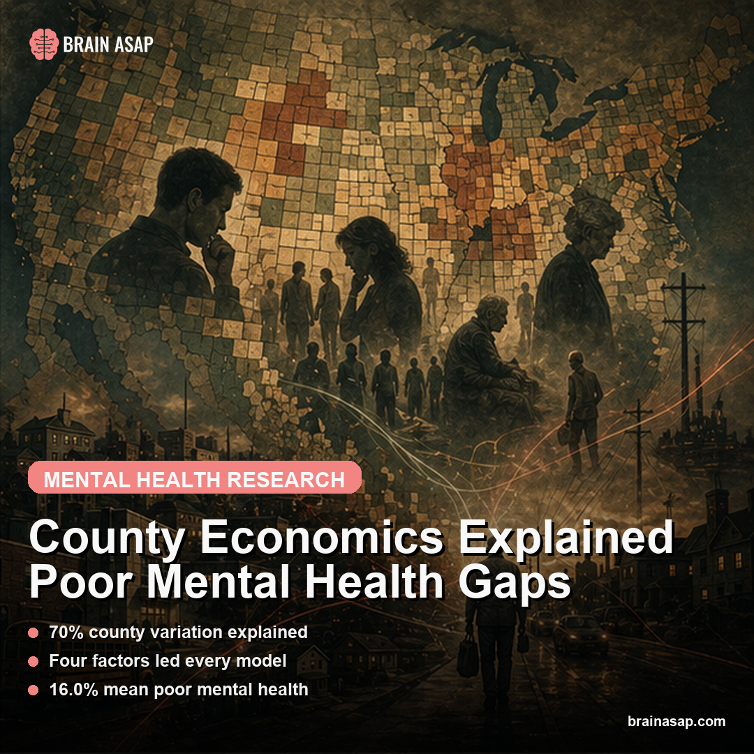
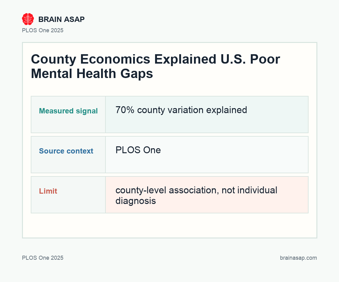
70% county variation explained: The overall model explained 70.0% of between-county variation in adults reporting more than 14 poor mental health days in the past month.
Four factors led every model: Household income, SSI receipt, SNAP receipt, and college-degree prevalence were the highest-ranked economic predictors across overall, urban, and rural analyses.
16.0% mean poor mental health: The mean county prevalence was 16.0%, with a range from 9.7% in Falls Church, Virginia, to 26.3% in East Carroll Parish, Louisiana.
Urban and rural insurance split: Public insurance moved in opposite directions: inversely associated with poor mental health in urban counties but positively associated in rural counties.
Pre-pandemic baseline: The 2019 design gives a snapshot before COVID-19 rewired work, social services, and local mental health strain.
Source: PLOS One (2025) | Bolduc et al.
Mental health maps often look like medical maps, but this paper makes them look uncomfortably economic. County-level poor mental health clustered where income, public assistance, education, and work conditions also clustered.
A Mental Health Map That Behaved Like an Economy Map
The study did not ask whether one person with lower income was more likely to feel distressed. It asked whether entire counties with different economic structures carried different burdens of poor mental health.
The county-level design changes the question. A county is not a clinic waiting room; it is a local economy, a housing market, a labor market, and a public-benefit ecosystem layered on top of daily life.
The analysis can guide planning even though it cannot diagnose individuals. County leaders have to decide where to put behavioral health capacity, food programs, disability navigation, transportation support, and workforce investment; those decisions happen at the same scale as the data.
SSI, SNAP, Income, and College Degrees Rose to the Top
The dominance analysis ranked the relative explanatory weight of each economic variable. Across all counties, the largest players were not exotic: median household income, households receiving Supplemental Security Income, SNAP receipt, and the share of adults with a college degree.
The pattern points to material security as a population-level mental health signal. Counties where more residents had financial and educational buffers tended to report fewer frequent poor mental health days, while counties with more visible need tended to report more.
Those variables are not interchangeable. Income captures purchasing power, SNAP marks food insecurity and eligibility for assistance, SSI often reflects disability or long-term functional limitation, and college-degree prevalence captures education, job access, and neighborhood-level opportunity.
Together, they describe the everyday pressure around a county: whether people can afford food, whether disability is common enough to show up in benefit patterns, whether work is stable, and whether education creates options before crisis hits.
Dominance analysis is useful here because many economic variables travel together. Instead of only asking whether each variable had a statistically significant coefficient, the method estimates which predictors contributed most to the model’s explanatory power.
Urban-Rural Economics Changed the Insurance Link to Poor Mental Health
Most factors moved in the expected direction in both urban and rural counties, but public insurance did something more interesting. In urban counties it was negatively associated with poor mental health, while in rural counties it was positively associated.
That does not show public insurance harms rural residents. It more likely means public insurance carries different contextual information in rural places, where disability, poverty, provider access, and local economic fragility can be more tightly bundled.
- Urban counties: public insurance may mark access to coverage that buffers distress.
- Rural counties: public insurance may also mark disability, poverty, and limited provider availability.
- Interpretation: the same insurance variable can carry different social meaning depending on local infrastructure.
- Planning question: county leaders need to know whether coverage expansion is reaching people before distress escalates or mostly after disability and limited access have already accumulated.
The Result Is Not a Diagnosis of Any County
The outcome came from CDC PLACES estimates of adults reporting more than 14 mentally unhealthy days in the past 30 days. It is a useful distress measure, not a chart review of depression, anxiety, or psychiatric diagnosis.
The study is also ecological, so it cannot prove that changing one county-level variable would automatically shift mental health prevalence. Still, 70% explained variation is too large to treat economic context as background noise.
That caveat is not a technical footnote. Ecological data can show where distress concentrates, but it cannot say which individual in that county is distressed because of income, food insecurity, commute time, unemployment, disability, or untreated illness.
The strength of the design is scale. It can reveal patterns that clinics experience every day but rarely quantify: the patients arriving in crisis are also living inside local systems that make recovery easier or harder.
Policy Becomes Part of the Mental Health Toolkit
Mental health planning is incomplete if it stops at treatment slots, crisis lines, and medication access. County economics shape the background conditions in which distress develops, persists, and reaches care.
Income support, food assistance, commuting burden, educational opportunity, remote-work access, and local provider availability all sit upstream of distress. This paper gives decision-makers a county-level map of where those upstream forces may be concentrating psychological strain.
How to Read the County Economics Evidence
The evidence base here is a cross-sectional ecological analysis of county-level economic indicators and CDC PLACES poor mental health estimates for 2019. That design cannot prove what would happen if a county changed one policy lever, but it can identify which economic conditions travel with distress at population scale.
The sample also sets the boundary: 3,121 U.S. counties with modeled adult prevalence of more than 14 poor mental health days in the past 30 days. The unit is the county, not the individual patient, so the result should guide planning rather than diagnose residents.
The numerical anchor is large: the top economic models explained 70.0% of county variation overall, 68.7% in urban counties, and 69.1% in rural counties. A model that strong does not eliminate clinical causes of distress; it shows that local economic structure is part of the mental-health exposure.
For policy, the distinction changes the menu of responses. A county with high poor-mental-health prevalence may need more clinicians, but it may also need food support, disability navigation, transportation access, job stability, and school-to-work pathways.
That is why the model’s leading variables are useful even without proving causality. They identify systems that county leaders can measure and potentially change, rather than treating distress as only a downstream medical burden.
The pre-pandemic timing also matters. A 2019 baseline gives researchers a cleaner reference point before COVID-era job loss, remote work, school disruption, benefit changes, and social isolation altered both economic exposure and mental health reporting.
Where the Bolduc Result Fits Next
The larger value is that the paper turns mental health geography into a policy-readable map. It does not tell a county exactly which lever to pull first, but it makes income, food assistance, education, work, and insurance impossible to leave outside the mental health conversation.
The next step is longitudinal work that watches counties change. If income support, commute patterns, insurance access, or food assistance shift, the key question is whether mental health prevalence moves afterward rather than merely sitting beside those variables in one baseline year.
A stronger follow-up would also separate policy exposure from need. For example, rising SNAP receipt could mean worsening food insecurity, better enrollment among eligible households, or both; those interpretations imply different mental health interventions.
Paper: Economic factors associated with county-level mental health – United States, 2019. PLOS One. 2025;20(6):e0300939. DOI: 10.1371/journal.pone.0300939
Authors: Bolduc et al.
Study Design: Cross-sectional ecological analysis of county-level economic indicators and CDC PLACES poor mental health estimates for 2019.
Sample Size: 3,121 U.S. counties with modeled adult prevalence of more than 14 poor mental health days in the past 30 days.
Key Statistic: The top economic models explained 70.0% of county variation overall, 68.7% in urban counties, and 69.1% in rural counties.